We are excited to announce the latest release! DataClarity 2020.4 is packed with innovative features, improved capabilities, and compelling visualizations. Let’s take a deep dive into our greatest release so far.
Installation and configuration
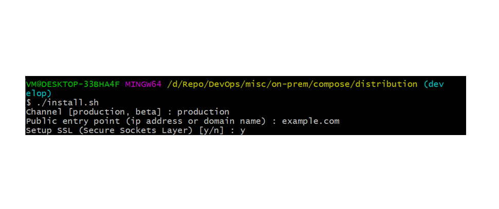
HTTPS support over SSL for Docker Compose installations
DataClarity helps you keep data secure and protected. Now, by enabling the HTTPS protocol (SSL), the system will establish the encrypted communication channel between your client and Data Server, and then pass the HTTP messages through it, effectively protecting them.
Prior to this release, the SSL was supported for Kubernetes installation only. In this release, when installing DataClarity using Docker Compose, administrators can specify whether to enable HTTPS when accessing the platform through a browser, and SSL when connecting to the Data Server. If no SSL certificate is provided in the respective certificate location, then the self-signed certificate is generated automatically.
Data Preparation
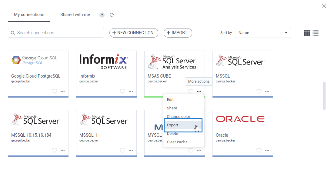
Export and import data connections
Managing data connections now offers more flexibility by allowing export and import of data connections. This way, data connections can be easily reused on different environments saving your time spent on re-creating new connections.
In the Data connections pane, you can export any of your data connections by using the Export option under the More actions menu. The data connection details that you are exporting are saved into a ZIP file.
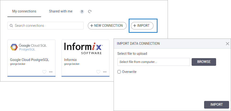
To import a data connection, just upload a ZIP file with the data connection. In the Data connections pane, clicking the Import button will open the dialog for the file import. Here you have the option to overwrite the connection in case the same data connection has been imported previously. If the identical connection already exists, then the data connection will not be imported.
Hide dataset columns
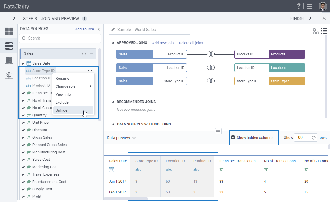
When preparing a dataset, as a modeler, you might need some columns for establishing joins between the tables, and others for creating calculations and filters, but you don’t necessarily want those columns to appear in the final dataset for consumers.
This release allows you to hide the dataset columns you used for dataset filters or calculations. This process is available in Step 3 – Join and preview. A column will be hidden by clicking it. You can still use the column for filters and calculations, but it will be hidden.
Moreover, all hidden columns can be previewed in the data preview table. To do so, you can use the Show hidden column check box that has been added to the dataset preview pane.
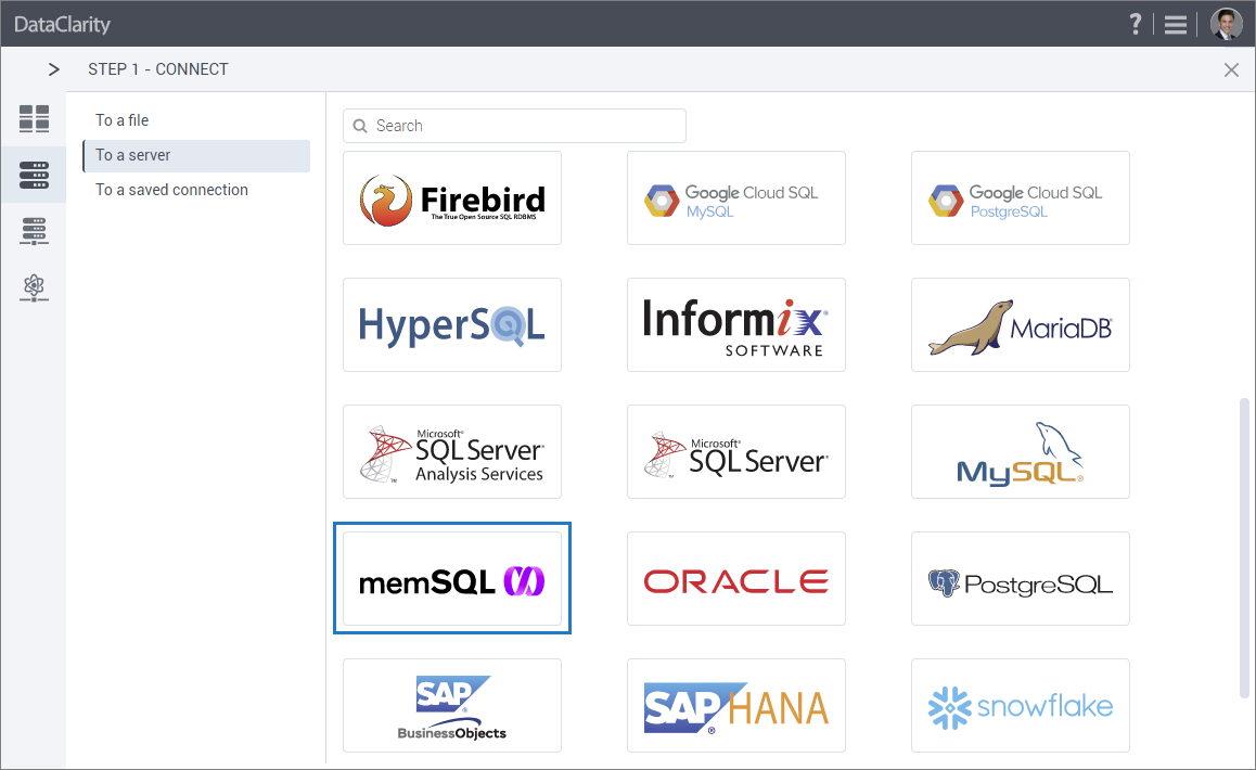
Support MemSQL as a data connection
If your data resides in MemSQL (a relational SQL database), you can now easily add a data connection to this data source, cache it, and visualize a dataset based on MemSQL.
To create a new connection, click the MemSQL data source connection icon that has been added in Data Preparation, to the Data connections pane.
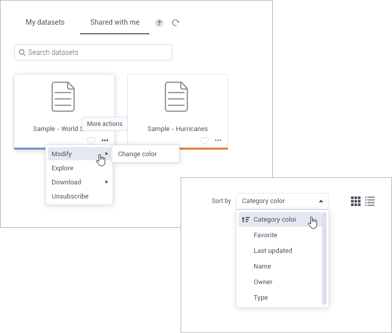
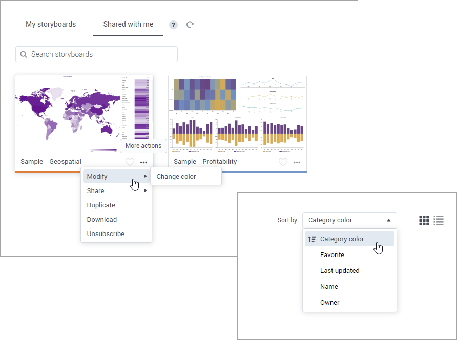
Sort shared datasets by category color or favorite tag
Prior to this release, dataset owners could categorize their datasets by color and mark them as favorites. In this release, dataset recipients can also sort shared datasets by Category color or Favorite options.
Longer column names
You are no longer restricted to 30 characters for the column names in datasets. Now, the size has been extended to 60 characters to allow more flexibility for naming conventions.
STORYBOARDS
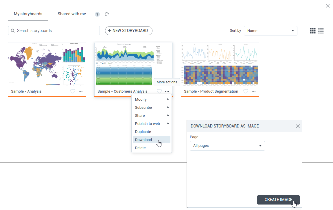
Download storyboards as images
This release provides a great feature for printing storyboards, which can be useful for meetings and discussions. You can choose to download one selected page or all storyboard pages as PNG images, and then print or share them with your colleagues.
To do so, for the storyboard (tile or row) that you want to download, point to More actions, and click Download. Multiple pages of the storyboard will be automatically saved into a single ZIP file.
User notifications
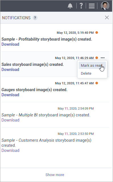
Starting this release, all the incoming notifications that require user attention or assistance can be reviewed in the new Notifications pane. The number of new unseen notifications is placed over the notification icon on the toolbar, which will disappear after previewing the messages in the pane. To ensure great performance, a certain number of messages is visible at once. Just click Show more at the bottom of the pane to navigate to the following set of notifications.
On this pane, you can view notifications with the images of storyboard pages that are ready for download. For each notification, you can see the respective storyboard name, date and time of the message, and the link to download the images.
Unread messages are marked with the indicator on the right. To mark the notification as read, point to More options, and then click Mark as read. To remove a notification from the list, point to More options, and then click Delete.
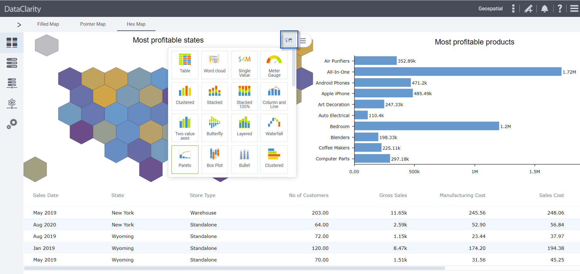
Bullet chart visualization widget
In this release, DataClarity users can benefit from the new visualization – a bullet chart. A bullet chart is a simple visualization that has a lot of advantages for the storyboards visualizing KPIs (Key Performance Indicators) like revenue, expenses, new customers, expenses, and others. The chart is informative, easy to read, while requiring less real estate comparing to other extended gauges.
A bullet chart compares the performance of one measure against another related measure, for example, sales and sales forecast. Adding a dimension will also compare measures among dimension values. Additionally, a measure of interest can be evaluated against defined qualitative ranges (for example, poor, average, and good).
The Appearance tab of the widget settings allows you to customize labels and colors of the comparative ranges. You can also choose whether to include them on the legend.
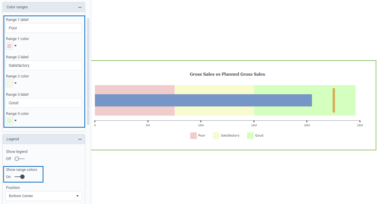
Note that the comparative value is usually the point that the measure should reach or exceed, such as a sales target.
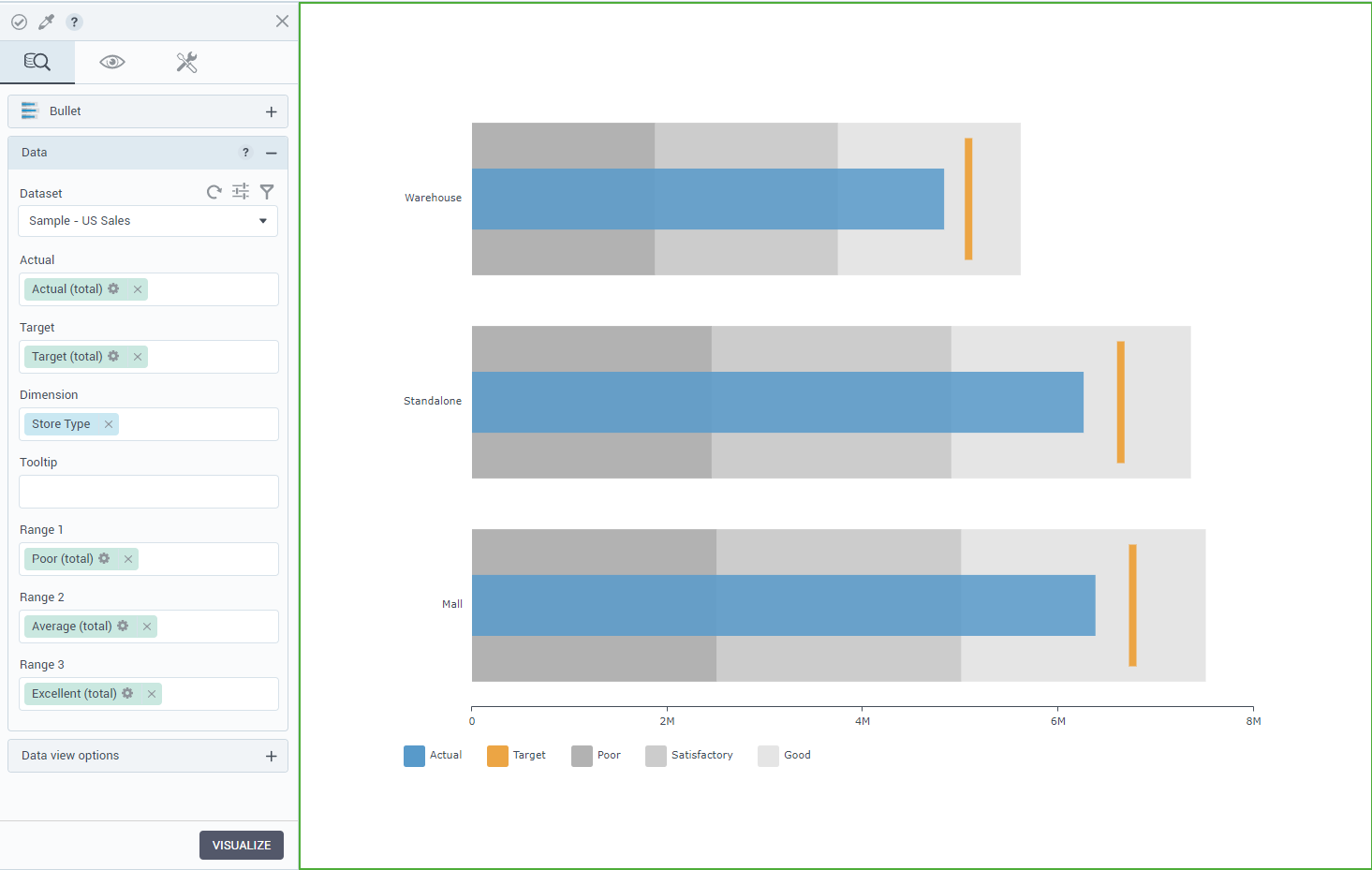
However, when you evaluate an expense target, the target functions as a point that the measure should stay below.
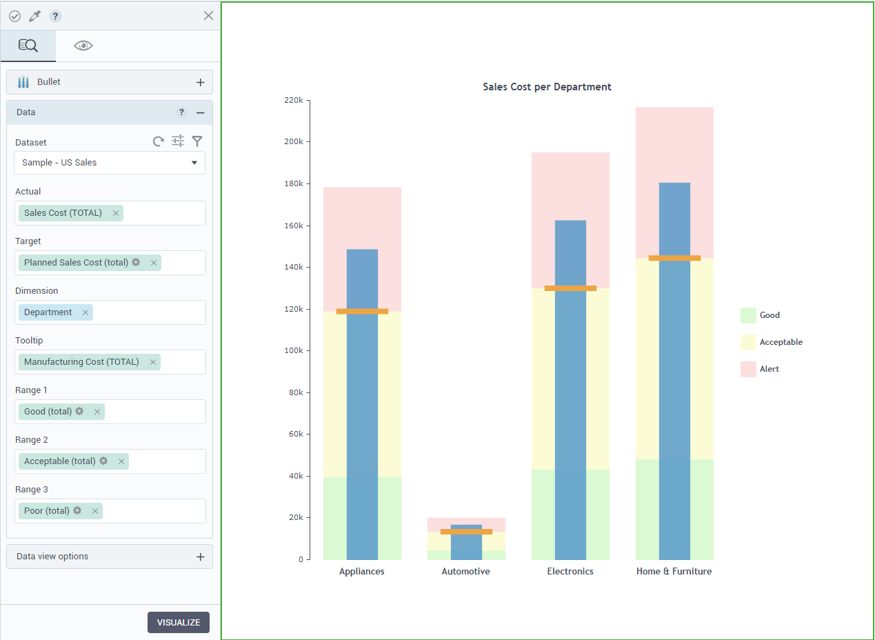
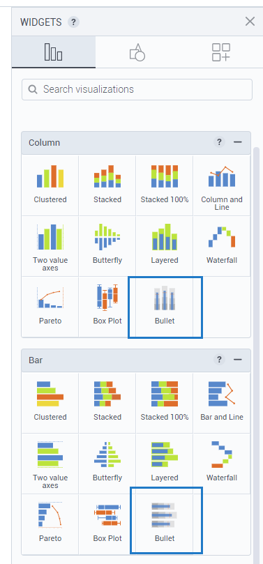
In the widgets gallery, you can find a bar bullet chart (oriented horizontally) or a column bullet chart (oriented vertically). You can easily switch the type at any time.
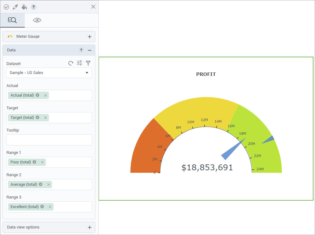
Gauge chart visualization widget
Another useful and informative visualization of this release is a meter gauge. A gauge is a simple visualization that has a lot of advantages for the storyboards that are visualizing KPIs (Key Performance Indicators) like revenue, expenses, new customers, expenses, and others. The chart is visual and easy to read.
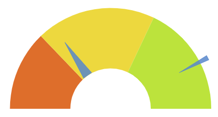
The Meter gauge visualization uses needles to show information as a reading on a dial. The needles for actual and target values can be read against the axis and additionally against three qualitative data ranges.
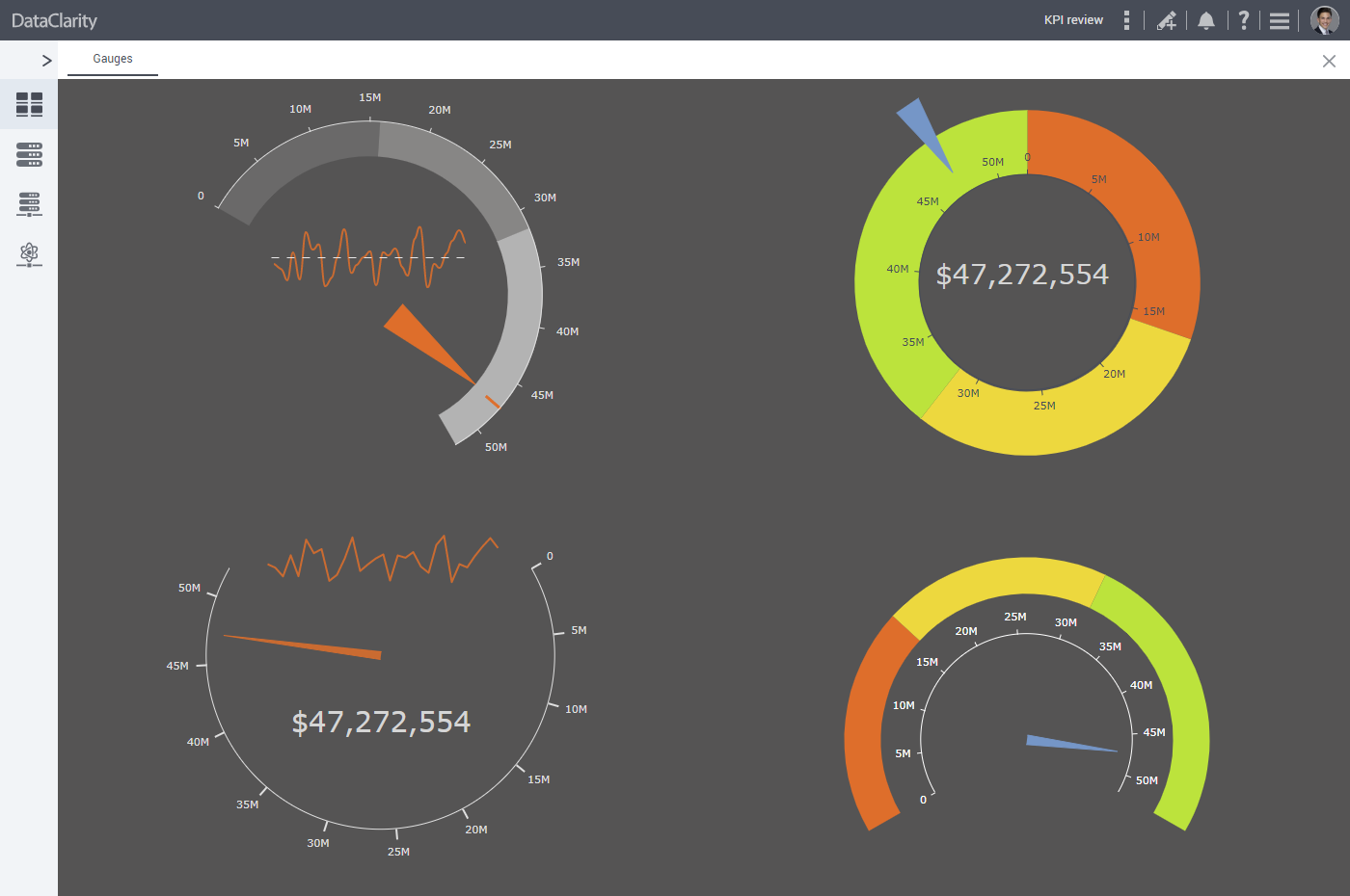
Colored ranges bar
The ranges can be calculated to indicate the areas corresponding to poor, average, and good performance, for example. To fit various business cases, the widget settings allow you to customize labels and colors of the comparative ranges.
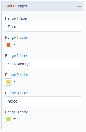
The colored ranges bar can be customized to start and end at a certain distance relative to the center.
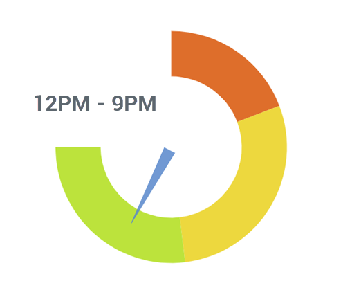
Gauge shapes
You can start and end the gauge dial at any position by using the clock analogy–an intuitive way to build the needed shape of your gauge. With the options from 12 am to 12 pm, you can easily build the axis clockwise or counterclockwise. For example, to build a standard half-circle dial, use 9 am for the start position and 3 pm ending position.
Needles pointing to the actual and target values
Needles showing the value of interest and the one indicating the target are easily customizable. You can specify where the needles start and end (as the distance from the center), and which is the width of the starting and ending needle points. Setting the same width for the start and end needle points will turn them into lines instead of arrows.
Sort storyboards by category color and favorite tag
Prior to this release, storyboard owners could categorize their storyboards by color and mark them as favorites. In this release, storyboards recipients can also sort storyboards by Category color or Favorite options.
Various UI/UX enhancements
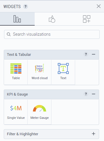
Widget sections rearrangement
To improve widget findability, the Text widget has been moved from Other widgets tab to the Text & Tabular section. The KPI & Gauge section has been added to place the new Meter gauge visualization. The filter and highlighter widgets are now in their dedicated section as well.
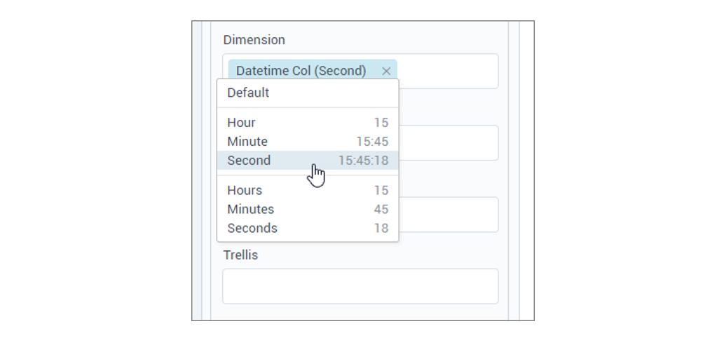
Default aggregation for Time columns
The default aggregation for the “Time” columns is now set to “Second” instead of “Hour”.
Get started with DataClarity or upgrade to DataClarity 2020.4 today to take advantage of all of these new features.