The newest release of DataClarity is here! DataClarity 2020.2 is packed with innovative features and improved capabilities over previous versions. Let’s take a look at our latest release.
Data Preparation
Reuse uploaded files to create multiple datasets
Now, users can reuse uploaded files as saved connections when creating new datasets. When a file is uploaded to the system, the file connection is added automatically in the Data connections pane. Afterwards, it can be used as any other connection. When managing a file connection, you can edit its name, share it with other users, set to cache it, clear its cache, categorize by color, or delete the connection.

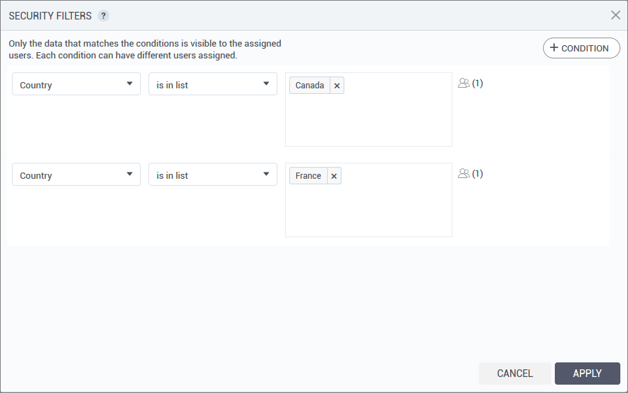
Restrict the rows of data a certain user can see in a dataset
Previously, when dataset managers shared a dataset, all the data was visible to all dataset consumers. Now, a dataset modeler can use the Row Level Security (RLS) capability to add a security filter to specify which data rows any assigned consumer can access in the shared dataset. For example, if a dataset contains sales data for different regions, the row-level security (RLS) allows each manager to see only the data that is relevant to the corresponding region and not the whole dataset.
To add a row level data filter, you add one-line conditions and assign users to the corresponding subset of data. Each condition can have the same or different users or groups assigned. Only the data that matches all the conditions is visible to the assigned users.
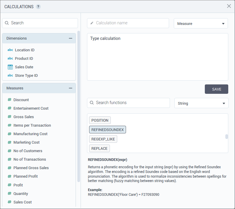
Calculations: new functions for string phonetic encodings
To normalize inconsistencies between spellings for better matching (fuzzy matching between string values), users can now calculate phonetic encodings for string columns by using the following new built-in functions:
- DOUBLEMETAPHONE(expr) – Returns a phonetic encoding through the Double Metaphone algorithm. The algorithm removes silent letters, normalizes combinations of characters to a single formula, and removes vowels (if it is not a first letter). For example, DOUBLEMETAPHONE(‘Floor Care’) will return FLRK.
- METAPHONE(expr) – Returns a phonetic encoding through the Metaphone algorithm. The algorithm removes silent letters, normalizes combinations of characters to a single formula, and removes vowels (if it is not a first letter). For example, METAPHONE(‘Floor Care’) will return FLRK.
- SOUNDEX(expr) – Returns a phonetic encoding through the Soundex algorithm. The encoding is a four-character code based on the English word pronunciation. For example, SOUNDEX(‘Floor Care’) returns the code F462.
- REFINEDSOUNDEX(expr) – Returns a phonetic encoding for the input string (expr) by using the Refined Soundex algorithm. The encoding is a refined Soundex code based on the English word pronunciation. For example, REFINEDSOUNDEX(‘Floor Care’) returns the code F27093090.
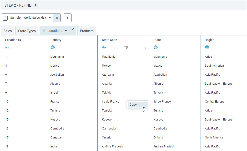
Copying values from tabular preview
Now, users can right-click any cell on the tabular data previews and copy the respective value. This feature can be useful when adding values against which you want to filter the dataset or create security filters.
Storyboards
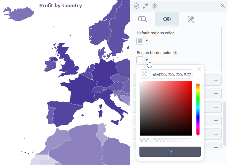
Border color for regions on map visualizations
The new setting, Region border color, has been added to customize the borders of the regions on the geospatial visualizations. Users can set a color and the transparency level to match borders with background or visualization style.
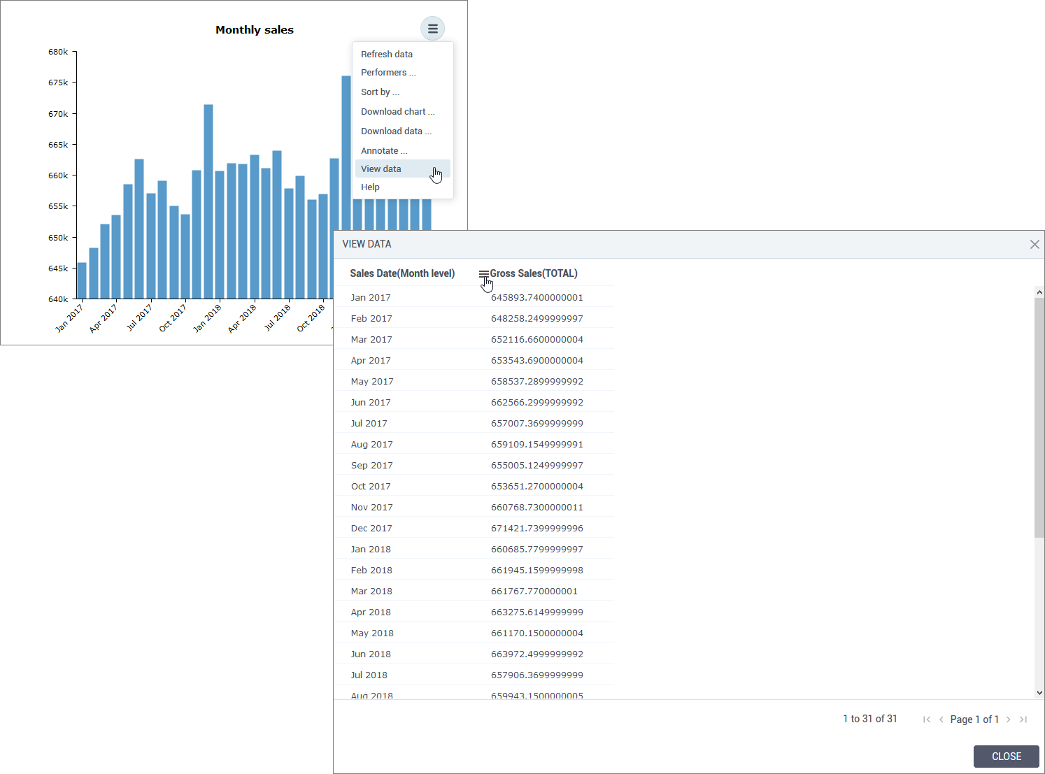
View data displayed in a visualization
The underlying data of the generated chart has been redesigned to improve usability and interaction with the data. Clicking View data in the widget options will open the table with the columns selected in data fields for the visualization, on the data tab. Now, users can interact with the columns as in the Table widget: include and re-include columns in the preview, search for a value in a column, filter the data in a column, and so on. If needed, users can also copy or export the table by using options of the right-click menu.
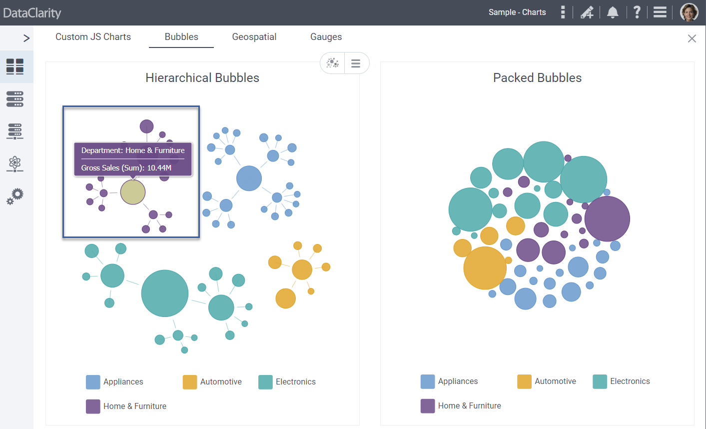
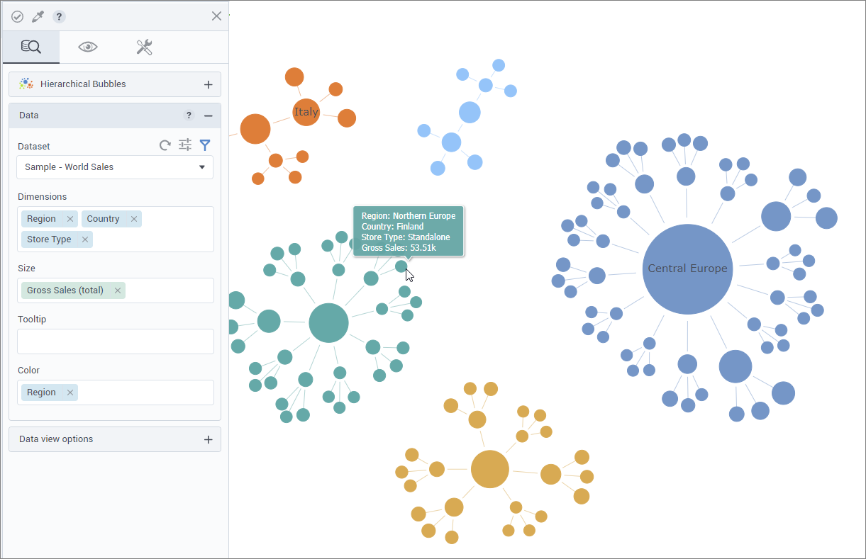
Hierarchical bubbles visualization (beta)
Now, users can benefit from the new Hierarchical bubbles visualization that shows hierarchical levels (dimensions) and the proportions (based on a selected measure) through a series of bubble nodes in a network-like structure. Also, users can color bubbles by a specified dimension.
The Hierarchical bubbles visualization has been added under the Network section in the Widgets pane on the Visualizations tab.
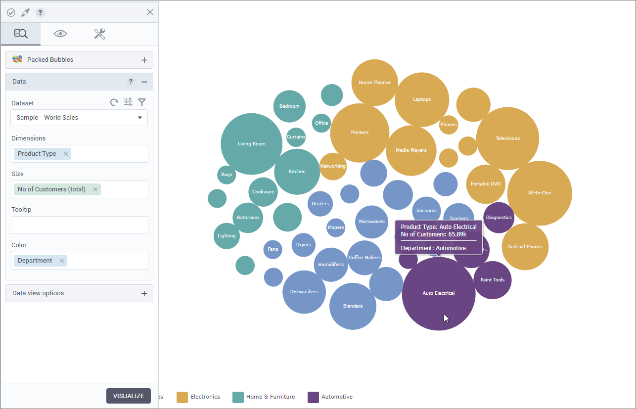
Packed bubbles visualization (beta)
Now, users can benefit from the new Packed bubbles visualization that shows all the values of the specified dimension as bubbles, where the bubble size represents a specified measure. Also, users can color bubbles by a dimension.
The Packed bubbles visualization has been added under the Network section in the Widgets pane on the Visualizations tab.
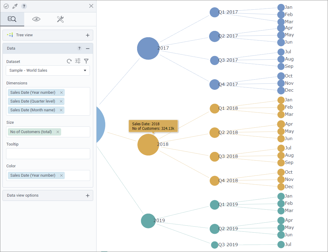
Tree view visualization (beta)
Now, users can benefit from the new Tree view visualization that shows hierarchical levels (dimensions) and the proportions (based on a selected measure) through a series of bubble nodes in a tree-like structure. Also, users can color bubbles by a specified dimension.
The Tree view visualization has been added under the Network section in the Widgets pane on the Visualizations tab.
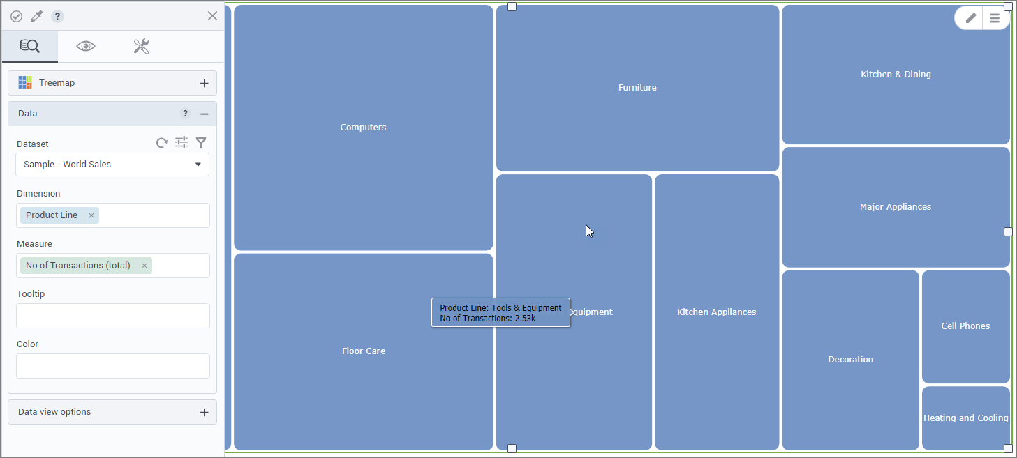
Treemap visualization (beta)
Now, users can benefit from the new Treemap visualization. Treemaps are used to visualize the data in the shape of rectangles proportional in size to their value of the selected measure.
The Treemap visualization has been added under the Area section in the Widgets pane on the Visualizations tab.
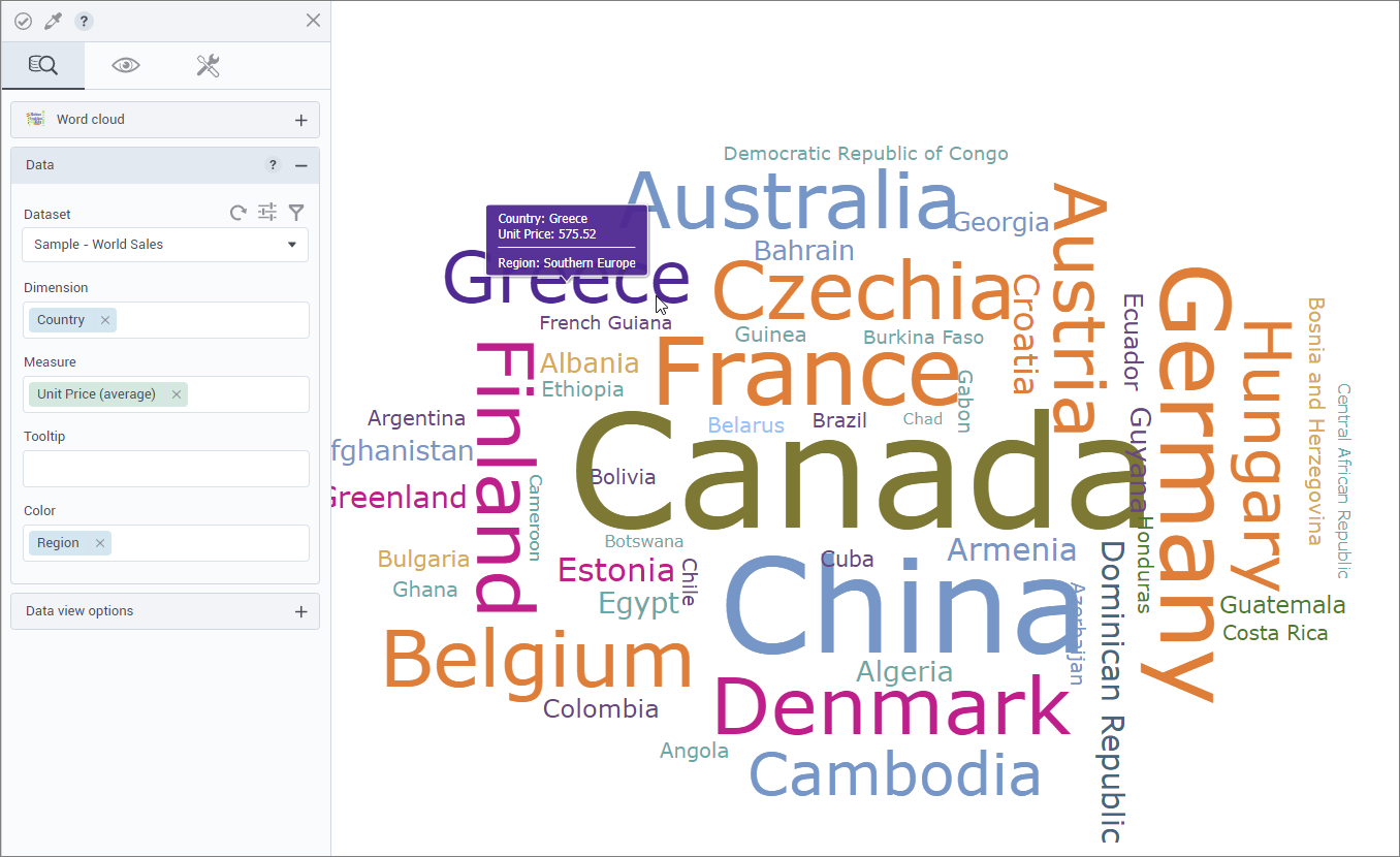
Word Cloud visualization (beta)
Now, users can benefit from the new Word Cloud visualization. Word Cloud allows users to visualize text data where the word size represents a measure assigned to it. For example, city’s names can be visualized by unit price in the respective cities. Also, users can color words by a specified dimension.
The new Word Cloud visualization has been added under the Network section in the Widgets pane on the Visualizations tab.
Get started with DataClarity or upgrade to DataClarity 2020.2 today to take advantage of all of these new features.